Line Charts with d3 js
Want to do a line chart with d3? There are no ready APIs right? At least none that I could find. What I did find was http://benjchristensen.com/2012/05/02/line-graphs-using-d3-js/ (very useful!) and I hacked up a line chart taking cue from there.
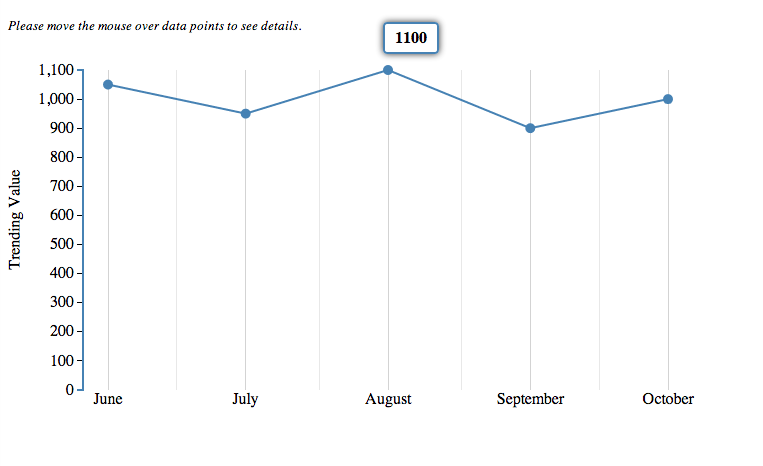
Here’s an example:
And the code?
	<!DOCTYPE html>
	<html lang="en">
	 <head>
	 <title>Line Charts</title>
	 <script src="http://code.jquery.com/jquery-1.8.2.min.js"></script>
	 <script src="http://d3js.org/d3.v2.js"></script>
	 <script type="text/javascript">
	 function getDate(d) {
	 var dt = new Date(d.date);
	 dt.setHours(0);
	 dt.setMinutes(0);
	 dt.setSeconds(0);
	 dt.setMilliseconds(0);
	 return dt;
	 }

	function showData(obj, d) {
	 var coord = d3.mouse(obj);
	 var infobox = d3.select(".infobox");
	 // now we just position the infobox roughly where our mouse is
	 infobox.style("left", (coord[0] + 100) + "px" );
	 infobox.style("top", (coord[1] - 175) + "px");
	 $(".infobox").html(d);
	 $(".infobox").show();
	 }

	function hideData() {
	 $(".infobox").hide();
	 }

	var drawChart = function(data) {
	 // define dimensions of graph
	 var m = [20, 40, 20, 100]; // margins
	 var w = 700 - m[1] - m[3]; // width
	 var h = 360 - m[0] - m[2]; // height

	data.sort(function(a, b) {
	 var d1 = getDate(a);
	 var d2 = getDate(b);
	 if (d1 == d2) return 0;
	 if (d1 > d2) return 1;
	 return -1;
	 });

	// get max and min dates - this assumes data is sorted
	 var minDate = getDate(data[0]),
	 maxDate = getDate(data[data.length-1]);

	 var x = d3.time.scale().domain([minDate, maxDate]).range([0, w]);

	// X scale will fit all values from data[] within pixels 0-w
	 //var x = d3.scale.linear().domain([0, data.length]).range([0, w]);
	 // Y scale will fit values from 0-10 within pixels h-0 (Note the inverted domain for the y-scale: bigger is up!)
	 var y = d3.scale.linear().domain([0, d3.max(data, function(d) { return d.trendingValue; } )]).range([h, 0]);

	// create a line function that can convert data[] into x and y points
	 var line = d3.svg.line()
	 // assign the X function to plot our line as we wish
	 .x(function(d, i) {
	 // return the X coordinate where we want to plot this datapoint
	 return x(getDate(d)); //x(i);
	 })
	 .y(function(d) {
	 // return the Y coordinate where we want to plot this datapoint
	 return y(d.trendingValue);
	 });

	 function xx(e) { return x(getDate(e)); };
	 function yy(e) { return y(e.trendingValue); };

	$("#chart").append("<p><small><em>Please move the mouse over data points to see details.</em></small></p>");

	// Add an SVG element with the desired dimensions and margin.
	 var graph = d3.select("#chart").append("svg:svg")
	 .attr("width", w + m[1] + m[3])
	 .attr("height", h + m[0] + m[2])
	 .append("svg:g")
	 .attr("transform", "translate(" + m[3] + "," + m[0] + ")");

	// create yAxis
	 var xAxis = d3.svg.axis().scale(x).ticks(d3.time.months, 1).tickSize(-h).tickSubdivide(true);
	 // Add the x-axis.
	 graph.append("svg:g")
	 .attr("class", "x axis")
	 .attr("transform", "translate(0," + h + ")")
	 .call(xAxis);

	// create left yAxis
	 var yAxisLeft = d3.svg.axis().scale(y).ticks(10).orient("left"); //.tickFormat(formalLabel);
	 // Add the y-axis to the left
	 graph.append("svg:g")
	 .attr("class", "y axis")
	 .attr("transform", "translate(-25,0)")
	 .call(yAxisLeft);

	// Add the line by appending an svg:path element with the data line we created above
	 // do this AFTER the axes above so that the line is above the tick-lines
	 graph
	 .selectAll("circle")
	 .data(data)
	 .enter().append("circle")
	 .attr("fill", "steelblue")
	 .attr("r", 5)
	 .attr("cx", xx)
	 .attr("cy", yy)
	 .on("mouseover", function(d) { showData(this, d.trendingValue);})
	 .on("mouseout", function(){ hideData();});

	 graph.append("svg:path").attr("d", line(data));
	 graph.append("svg:text")
	 .attr("x", -200)
	 .attr("y", -90)
	 .attr("dy", ".1em")
	 .attr("transform", "rotate(-90)")
	 .text("Trending Value");


	 $("#chart").append("<div class='infobox' style='display:none;'>Test</div>");
	 }

	var draw = function() {
	 var data = [ {'date': "2012-10-01", 'trendingValue': 1000}, {'date': "2012-09-01", 'trendingValue': 900}, {'date': "2012-08-01", 'trendingValue': 1100}, {'date': "2012-07-01", 'trendingValue': 950}, {'date': "2012-06-01", 'trendingValue': 1050}];
	 drawChart(data);
	 }
	 </script>
	 <style>
	 #chart path {
	 stroke: steelblue;
	 stroke-width: 2;
	 fill: none;
	 }
	 .axis { shape-rendering: crispEdges; }
	 .x.axis line { stroke: lightgrey; }
	 .x.axis .minor { stroke-opacity: .5; }
	 .x.axis path { display: none; }
	 .y.axis line, .y.axis path {
	 fill: none;
	 stroke: #000;
	 }
	 .infobox {
	 border:2px solid steelblue;
	 border-radius:4px;
	 box-shadow:#333333 0px 0px 10px;
	 margin:200px auto;
	 padding:5px 10px;
	 background:rgba(255, 255, 255, 0.8);
	 position:absolute;
	 top:0px;
	 left:0px;
	 z-index:10500;
	 font-weight:bold;
	 }
	 </style>
	 </head>
	 <body onload="draw();">
	 <div id="chart">
	 </div>
	 </body>
	</html>